|
一个缺失的位置,项目位于商场的边角,一个商业气息最差的位置,感觉是一个被遗忘的角落。如何改变这个结果是设计策略一个重要的组成部分。 The project is located at a mall's corner, which seems like a forgotten area because of its low person flow.Therefore, changing this situation is a very important part of the design strategy. 设计思考 Design Thinking ━ Novacolor是源自意大利艺术涂料,始于研制一些历史悠久石膏类天然矿物质涂料。如何让200种漆面的质感与色彩展示在一个180㎡的空间中处于和谐的位置,同时通过视觉与体验带来商业引流,这是我们骨子里的动机,为了达到一个结果而不是一个目的。 Novacolor was established in Italy, and originated from developing some natural mineral paints that have a long history. The design team aims to display 200 paints’textures and colors harmoniously in a 180-square-meter space, and attract more customers through eye-catching exhibition and wonderful experience. 自由平面 Free Plane ━ 不规则的几何线条互相交织/分离,一个散而聚的矛盾体构成了一个自由开放的几何平面,为通透开放,自由流动的空间性格奠定了基础,简单的几何体量,无装饰的立面造型,缝隙窥视的既视感,为空间阐述着一种新的氛围,以小见大。 Irregular geometric lines are intertwined or separated. These contradictory lines constitute a free and open geometric plane, laying the foundation for a smooth and freely flowing space. The simple geometric volume, non-decorative elevation and the mystery of peeping through the gap present a new atmosphere for the space. The whole spatial pattern can be imagined from small details. 呼吸 Breath ━ 一次不一样的思考,通常是比例、形体、材料、光线,细节来支撑空间,而这次是空间反过来支撑材料,材料才是这个空间的主体,需要表现与被表现的。空间为材料退让,把空间留给人,为人提供大量的交流和互动的机会。自然的白色、灰色水泥质感与银色金属漆墙面与入口的黑色洞石质感墙体,几种不同感受的质感有机的融合在空间里。 Generally, a space is enhanced by proportions, shapes, material, light and details, but thistime, the focus of the space is material, which needs to be exhibited. The space provides people with more opportunities to communicate and interact. Thenatural white color, gray cement texture, silver metallic paint wall and the black travertine wall of the entrance are organically integrated in the space. 展示柜体成为分割空间唯一物质,与顶部分离,这种空间的延续处理,蓝色的小巨蛋存在角落的最高点,与人活动的过程都可以若隐若现的对话,更好的强调空间神秘与趣味的精神。地板堆叠的长方体砖块,是黑色金属漆在粗糙质感下的一次尝试,意图表现漆的多样性与可以表达各种情绪。让人可以感受空间与材料在呼吸。 The display cabinet separated from the top is the only element that divides the space. The small blue ellipsoid is set at the highest point of the corner andable to create fascinating interactions with visitors, which emphasizes the mystery and fun spirit of the space greatly. The stacked rectangular bricks onthe floor attempt to show the black metallic paint with rough texture, intending to express the diversity of paint and various emotions. In this way, people canreally feel the space and materials are breathing. 一次视觉策划 Visual Planning ━ 有计划的将空间转折的入口尺度缩小,提示你进入不同情绪与味道的世界,小的口会让你对后面的事情产生兴趣与想象力,蓝色的小巨蛋形几何体从天而降,与平面的曲线相呼应,且产生强烈的力量感。 The transitional space's opening is specifically downsized, which is a clue toenter a world of different emotions and styles. A small opening can stimulate people's interest and imagination. The small blue ellipsoid hung on the top echoes with the curve of the plane and generates a strong sense of power. 空间通过球体划分了一个弹性的空间,这个场域人是空间的主体,没有被围合却拥有最强场所感的区域,一个人与空间能交流的场所,自由的空间。蓝色与前台的蓝色相互平衡,让两者有一种孤独的对话的情绪。用严谨的几何秩序来构建感性的场域,矛盾与协调的构筑。 A flexible space is divided by a sphere. In the space, people are the focus. Thisis an open area with strong spirit, in which people can communicate with thespace. The blue ellipsoid and the blue plate embedded in the reception desk are like two loners whispering to each other, forming a balanced feeling. The perceptual area is created through the meticulous geometric order. It’s a placeof contradiction and coordination. 低调与张扬的表情 Contradiction ━ 在材料的设计上,我们将自然沙面质感/凹凸金属质感与蓝色的羊皮质感进行碰撞,体现材料本身的张力,同时又将200多种丰富的材料样板做了隐藏,从而低调的渲染材料在空间中简洁的表现力,用矛盾来阐述一个关于漆的艺术展厅。 In terms of material, the natural concave-convex metallic texture and the blue sheep skin texture create a contrast. Mean while, more than 200 material templates are employed in a low-key way to demonstrate their conciseness in thespace. An artistic paint showroom is presented through contradiction. 电影性与戏剧化的光与影 Cinematic And Dramatic Light And Shadow ━ 光是表现空间情绪的重要介质,光影互相依存,空间中大面积大拉膜,强调光线的柔美均衡,一方面更好的服务于空间中产品的照明,在情感上弱化了影的存在,营造一种戏剧化的安静,局部强化光影,表现材料质感的同时感受空间的躁动,一种压抑着的力量准备爆发。 Lightis an important medium for expressing the emotion of a space. Tesioned membrane structure is applied in a large area to emphasize the softness of light. On the one hand, the structure enhances the products' lighting effect and weakens the shadow emotionally, which forms a kind of dramatic silence. On the other hand,the light and shadow are partially intensified to express the texture of thematerial and the restless feeling of the space. A repressive poweris likely to be released. 这一次把空间简单的变成美学问题,做一些触动神经的事情。 Thistime, the team regarded the design as an aesthetic practice, and tried to dosomething heart -touching. Information ━ 项目名称:Novacolor艺术漆展厅 Project Name: Novacolor Paint Showroom 设计机构:艾克建筑设计 Design Firm: AD ARCHITECTURE 总设计师:谢培河 Chief Designer: Xie Peihe 设计团队:艾克建筑 Design Team: AD ARCHITECTURE 项目地点:广东汕头 ProjectLocation: Shantou,Guangdong Province, China 建筑面积:180平方米 ProjectArea: 180m 2 主要材料:不锈钢、艺术漆、微水泥、透光膜、雾化玻璃 Main Materials: Stainless steel, paint, microciment, transparent film, switchable glass 设计时间:2020年3月 Design Time: March 2020 竣工时间:2020年7月 Completion Time: July 2020 摄影师:欧阳云 Photographer: Ouyang Yun Ynterview ━ Yinji:你是怎么遇到这个项目的?在与业主合作的过程中有些什么趣事 ? Yinji: How did you come across this project? What are some particularly interesting stories from working with the owners? AD: 业主应该是从16年他们进入这个装饰行业就认识的,对我们艾克建筑也有比较深的认识,所以去年底就直接委托我们来帮忙做这个项目。业主比较信任我们,所以整个过程会比较顺利,没有特别的事情,但是几次开会我都没有和业主谈如何做设计,而是和交流一些经营上的问题以及产品和未来发展的思路,可能这也让业主都我们会有更好的信心。我们并不是单纯从形式来做设计。 AD: The owner should have known this decoration industry since they entered it in 2016. They also have a deep understanding of AD Architecture, so they directly commissioned us to help with this project at the end of last year. The owner trusts us, so the whole process will go smoothly, without any special things. However, I did not talk with the owner about how to do the design in several meetings, but communicated with him about some operational problems, products and ideas for future development, which may also help the owner to have better confidence. We don't do design purely in terms of form. Yinji:在这个作品中,你是怎么去处理展示产品与空间的关系? Yinji: How did you deal with the relationship between the presentation and the space? AD:这个案子在产品展示上我们做了一次大胆的实验,空间整体选用了五个型号来运用到空间的入口、立面、天花以及地面,没有传统的模拟间,而是将产品纯粹的展示于柜体中,通过抽屉的方式来隐藏丰富的样板。让产品展示适当的为空间让步。 AD: In this case, we did a bold experiment on the product display. The whole space chooses five models to apply to the entrance, facade, ceiling and ground of the space. There is no traditional simulation room, but the products are purely displayed in the cabinet, and rich samples are hidden by means of drawers. Let the product display be properly compromised for space. Yinji:设计展厅与其它类型的商业空间,你有什么不同的设计思考? Yinji: Do you have any different design thoughts between the exhibition hall and other types ofcommercial space? AD:展厅设计与其他类型的商业空间都必须具备的共同点是如何提升品牌的影响力,以及商业引流,既然都是属于商业空间,那么流量、刺激消费和存活率都是平衡商业好坏的最直接标准,一个装饰材料相关的展厅,他和美学的距离会更加的接近,所以会更加的强调空间的艺术性以及先锋性。 AD: Exhibition hallde sign and other types of commercial space must have in common is how to promote the brand influence, as well as commercial drainage, now that is belong to the commercial space, then the flow, stimulate consumption, and survival is balance the criteria of the most direct business, a decorative materials related to the exhibition hall, and his aesthetic distance will be more closeto, so will be more emphasis on the artistic quality of space and pioneering. 业主反馈 Feedback ━ 对于一个展厅,我们丰富的产品线如何融合与展现,通过馆的设计,更好的符合自身的定位,是我们需要思考的问题。在这点上,AD艾克建筑无疑能很好地契合我们需求。对于AD的设计,总能让我们眼前一新,打破我们原有的设计体系与心理预期,不仅帮我们设计一个与众不同的展馆,同时也帮我们更好的重塑自身商业定位。感谢AD帮我们设计该项目,让我们Novacolor艺术漆产品得以更好的方式来展现。 For an exhibition hall, how to integrate and display our rich product lines and better meet itsown positioning through the design of the hall is the question we need to think about. In this regard, THERE is no doubt that AD Architecture fits our needs well. AD design can always refresh our eyes and break our original design system and psychological expectations. It will not only help us design a unique exhibition hall, but also help us better reshape our business positioning.Thanks to AD for helping us design this project, our Novacolor art paint products can be presented in a better way.
| 
 cad许可管理器不起作用或未正确安装。现在
AutoCAD许可证管理器错误可通过检查服务状态、重新安装许可组件或禁用冲突软件解决
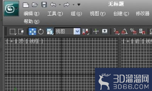 3Dmax怎么调出VRAY材质编辑器?
VRAY是3Dmax里面很常见的一个插件,我们想要在3Dmax不仅需要安装,还需要在对应的入口
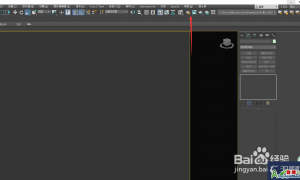 3DMAX装完vray后怎么在渲染时调出
3Dmax经常搭配vray使用,但有的小伙伴VRay安装完了,但是渲染设置里没有,或者不知道3
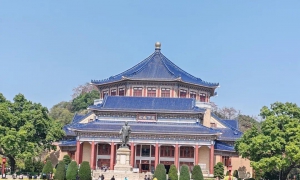 走进中山纪念堂,了解一代大师吕彦直
我去过中山纪念堂很多次,大多是去看公益演出。有时路过,也会被它的外观吸引,不自
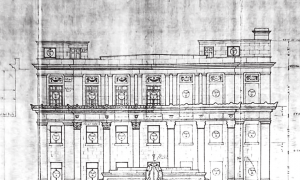 业师和雇主眼中的吕彦直—— 一份 1928 年
编者按:
2024年是吕彦直先生(1894年7月28日-1929年3月18日)诞辰130周年。他是中
 cad许可管理器不起作用或未正确安装。现在
AutoCAD许可证管理器错误可通过检查服务状态、重新安装许可组件或禁用冲突软件解决
 3Dmax怎么调出VRAY材质编辑器?
VRAY是3Dmax里面很常见的一个插件,我们想要在3Dmax不仅需要安装,还需要在对应的入口
 3DMAX装完vray后怎么在渲染时调出
3Dmax经常搭配vray使用,但有的小伙伴VRay安装完了,但是渲染设置里没有,或者不知道3